 So I had planned to do a post on art in general but it turned into something of rant, I think, so that can go on my other blog over at Infinity Flawed. The general Idea of it though was that I have come to the conclusion that I could probably teach people how to draw, the basics anyway, so instead of 'telling' like I do in that post I decided to 'show'.
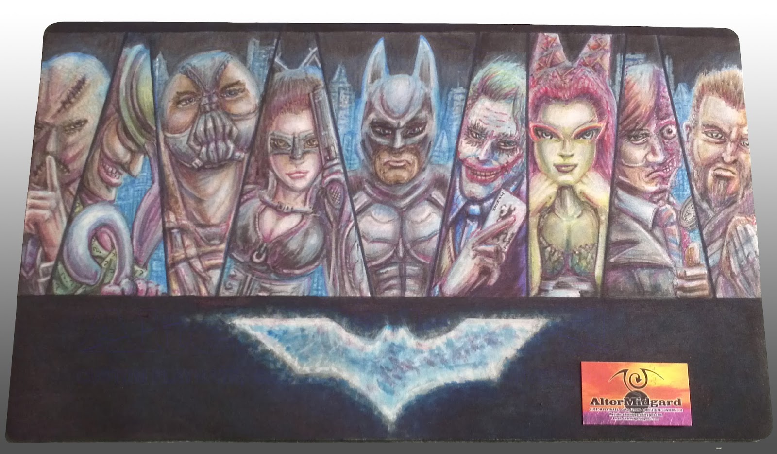
With that in mind today I'm going to look at the production of the Batman mat and hopefully give some insights into it's production and things like shadows and highlights. but I'm getting ahead of myself lets start at the beginning.

1. I start by masking off the areas I don't want to get colour on just yet, this is something I have been doing a lot more of lately and helps in the creation of sharp lines. I mentioned on the muppets mat that you would start seeing more complex cut outs and heres the first of them where I'm using masking tape to create the shape of the logo. Its a little bigger than the logo needs to be but then the colour has a tendency to expand anyway even under tape in some cases.
2. I find it helpful to start with a light colour and just block in the important detail. the other option is to go in and do all the line work now but the problem with that is that you can find yourself having to redo the lines at the end anyway. You can see that the colour got in under the tape and into the area I would have preferred it not to. This was because the background colour isn't pure black, I was going for a cloudy blue effect and that meant keeping the colour quite wet. Its not really an issue we can sort it out later when we start using the second type of colours over it. I will discus colour flow in more detail in a future post.
3 & 4. It seems to be quicker to get the large colour blocks out of the way first, in this case after the hands and faces there is quite a bit of grey in the image. The same goes for the green. While having one of each colour is ok having a full range of greys or greens from light to dark makes things so much easier, especial since if you make a mistake with the dark colours the lighter ones will often go over it to change it back. The only thing you have to watch out for is that you dont overload an area with colour since no matter how many times you add a lighter colour it will start to go muddy and you wont be able to get back to white without using the remover.

5 & 6. You can see that the characters that are most complete were the ones that were mostly made up of the large blocks of colour from earlier, Joker's face is white so I have to be careful not to add too much colour to quickly and Scarecrow is brown so he's only got as far as the same shade of Bane's coat. Catwoman has a big hole for a face because I didn't like how the sketch turned out and decided to redraw it.
All the characters are based on the actors who played their movie versions, while most of them are from the Nolan movies Riddler and Ivy are more like composits of their actors from the older films with elements from the comics. I do a fair bit of research when making these mats and this particular one requited a quite considerable amount. Its also useful to have a mirror about, in this case Scarecrow's, Joker's and Two Face's hands are all based on poses of mine.
7 & 8. I have done a few of this style now and while its nice that people like it I tend to like mixing things up a bit. Which explains why while the first two mats had glowing blank backgrounds this one moves things forward slightly and adds a cityscape, albeit one that is slightly disjointed. From the beginning I knew I wanted the background to be the inverse of the first two though, it is Batman after all, the idea for the glowing buildings came later and the blue is quite nice as it turns out since it ties that section of the mat in with the logo. You can see I have also started to blend the blue into the shadows and highlights to make the characters fit a bit better into the world they inhabit, the shading on Riddler's cane or Batman's chest for example has become a lot more natural between 7 and 8.
9. Poor old Raz got left until last, somebody or something always seems to. One of the things I noticed when I started working on the mat was his sword was up to high on his chest, it was an odd position so that got fixed. On the plus side he does benefit from everything else I have learnt on this mat and he is one of my favourite elements especially the hair.
10. Finally, like so many of my mats, I work on the eyes I also go around darkening the shadows and doing the other line work. After all the time i spent on the shadows I don't really want it to be to obvious but because of the way the colour flows there is a certain amount of tightening up that has to be done.
Thats the stages of production out of the way now lets look at some smaller sections in more detail. It's worth remember thing though that these are blown up from camera images so the resolution would likely be higher had I remembered to scan the final mat in, have I mentioned I would like a scanner that was playmat size?

Not that easy to see on the prior images due ti the way I have displayed them this time but there is quite a bit of incidental detail on this mat. Wether its the tiny question marks on Riddler's jacket or the face on the coin, even Scarecrow's tie is more detailed than it probably needed to be since you can barely see it. The areas I like most though are things like the end of the gun, places where light and shadow come together to give an impression of texture using the technique described bellow.

I'm still not entirely sure why it works, something to do with our eyes most likely, since the real world doesn't really work like this. To get more natural results if the edge of your image is light add a dark line to it and vice versa. The end of the gun, for example, is just a dark cross hatch structure but because each cell created has a small light line on its upper edge it trick the brain into thinking thats the direction from which the light it falling on it. In the case on the edge of the faces the two girls are more successful while the guys cheeks are almost there but I don't think the light area on the opposite side of the dark line is quite light enough, at least not at this size and cut out from the rest of the image.

Additionally dont be afraid to shade using colours that arnt anthing to do with the base colour of your image, metals especially pick up shadows and highlights from the lights and other objects around them, Riddler's cane, for example, is picking up the purple of his gloves and the blue of the lights of the city, there is also a slight hint of green from his coat. Also skin looks a lot more interesting when its not just shades of pink, people don't tend to be pink anyway not really.
I'll leave it at that for now since this post has run quite long, next time I will look at the constant quest to find ways to keep mats safe from the terrors of human skin and the oils it produces
No comments:
Post a Comment